Beauty may well be in the eye of the beholder, but most people would find it hard not to be impressed by the stunning design of Forecourt Trader of the Year 2015, Gloucester Services. The site also took Forecourt Trader’s Best Design and Development award and it’s easy to see why. The whole petrol filling station is set down into the site, reducing its presence and giving the feeling that it’s carved out of the hillside. Much use is made of glass and timber, which looks modern but at the same time fits well with the landscape. Inside the service area building, it’s particularly spacious and it looks like no expense has been spared on fixtures and fittings. Imposing wooden beams have the latest light fittings strapped to them; there are modern stainless steel chillers full of tempting products; and tables set up that are filled with local goodies.
Design has always been important to Gloucester Services’ owner The Westmorland Family and the design of each of its sites is sensitive to both the surroundings and the environment. With Gloucester Services those surroundings are the Cotswold escarpment east of the M5, close to the famous Robinswood Hill.
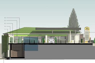
Laurence King, managing director of Westmorland, says: "The view of our site from those places was a concern for the planners not just how it would be seen once it was built but also in five or 10 years time. I certainly went and had a look at the site from those places a few times but also relied on things like CGI images to see what it would look like in the future. For example, the 60m-long forecourt canopy is covered in a wildflower meadow but the extensive planting on this and the shop building will take five to 10 years to grow and look its best. I’ve been to other new-build sites where initially it all looks a little bare but when you return you’re always amazed at how things grow and how mature the site looks.
"Here the pond and the swales (the channels in the earth that take the rainwater away) are mature but there’s still a lot of vegetation to grow. It will all thicken and develop over time."
The car parking area of Gloucester Services was intentionally sited in the lower contours of the site to hide the vehicles from view as much as possible. And the forecourt part is stripped back to just two elements a wall with kiosk, and canopy. The rear wall and kiosk are clad in locally sourced dry-stone walling making it possibly one of the only dry stone walled petrol filling stations in the country.
Given the sensitive nature of the site, a decision was taken not to allow the standard illuminated branded fascia and signage. Instead significantly reduced-height timber totems were installed, giving just enough information to the customer. Lighting levels within the canopy were also carefully specified to create a safe environment while reducing light spill and energy use.
There are 14 standard pumps and three HGV positions providing ample positions even in the busy summer months. The pump islands are set at an echelon angle to improve access for any motorway traffic towing caravans and trailers. Wider aisles are also provided to allow vehicles to manoeuvre between parked cars.
Westmorland chief executive, Sarah Dunning, confirms that design is hugely important to them. "When we put together our offer for the customer it is an amalgam of different things. It’s about what you can see from the outside through the seasons, through to the architectural design of the interior. It’s about getting the experience right for the customer."
She describes Westmorland’s developments as being ’of their place’. So Gloucester fits with the local landscape and community while Tebay is a Cumbrian version of that. Obviously there are commercial considerations but Dunning says that’s not their primary driver. "Our overall offer is a simple one a farm shop selling beautifully crafted food products and a kitchen selling proper home-made food. We’re in business because we love our offer and we want to do it well. From a commercial point of view, it obviously needs to deliver a return and it does."
As to whether customers appreciate the care and attention that goes into Westmorland’s design, she says: "People have different levels of appreciation. Our customers range from families and business people, to pensioners on coaches, stag and hen dos and lorry drivers. All these people will be looking for different things. Not everyone will notice everything but I think if we can satisfy the most discerning of customers then we’ll have done a good job."
It’s not just the Forecourt Trader award for design that Gloucester Services has won; it also picked up the Civic Voice National Design award.
Chair of the judges, architect Max Farrell, praised the scheme for being a ’game changer’ in the design of future motorway service stations. "The project was community led and is an outstanding achievement, using the surrounding rural landscape and farming community to improve employment, training and skills in neighbouring deprived communities," he said at the time of the awards.
BWB, the civil and structural engineers for the Gloucester Services project, also picked up a Project Design award at the ACE Engineering Excellence Awards last year. Associate director, Simon Hilditch, says: "After the presentation, an ACE spokeswoman stated that through the project BWB had distinguished itself as ’a trailblazer in careful and sensitive design with both the natural and built environments working together’. It was fantastic for all at BWB to be involved with such a pioneering project which has truly set new standards for motorway service provision in the UK."
Dramatic designs
In recent times the generic service station design has been replaced with something more dramatic by retailers wanting their sites to possess ’kerb appeal’. Examples of these include The Carsley Group’s site at Wyboston, Chartman’s Winning Post and the HKS site at Sandringham in Leicester.
The canopy is usually the largest structure on the site, standing prominently at the roadside to catch the eye of any passing motorists.
Global-MSI managing director, Martin Steggles, says more and more dealers now want a flagship site that has the ’wow’ factor and are prepared to invest slightly more for them. And an unusual canopy can immediately deliver that ’wow’. "A flat top canopy is the cheapest and that’s the reason why most forecourts have them they look like they do for that reason. Straying from the standard design adds costs but some retailers are very willing to pay for that, and for good reason," he says.
"Retailers that have invested in these iconic designs have seen a large rise in footfall and turnover."
Steggles adds that quite often dealers come to his company with a design so that gives staff some idea of what they want. "That design may have already been passed by the local planning authorities who must approve plans for the overall development. We usually receive an outline design or at least a design concept from the client that our in-house design team then develops into a full structural design."
Most canopies are made of metal primarily steel with certain elements of aluminium. "Occasionally other materials are proposed and concepts showing timber designs can look appealing. For forecourt canopies however, only steel possesses the required properties to provide an efficient structural design of the main canopy members."
Then there’s the decision of whether to ’link’ the canopy to the shop. "Some operators want it linked so when it rains people can fill up and get to the shop without getting wet, but others like to separate the fuel from the retail to give a clear distinction."
Steve Evans, managing director of the construction arm of The Premier Group, believes that the design aspect of a forecourt is probably the most important part of the process.
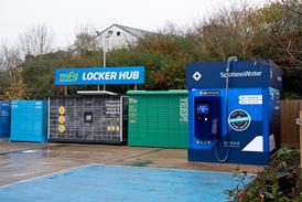
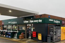
"The pre-contraction team is as important as the construction team. If you get this right, the development will be a success. It is important to look back as well as forward. If you look at how much the forecourt has changed over the past 20 years, just think how much it may change in the next 20. What can we expect? Will the c-store continue to grow? Can we expect e-shopping collection points, or more franchise offerings? By considering some of these factors you can, to a certain degree, future-proof your site so that alterations to the sales building and forecourt layout are flexible to allow for change."
Planning is essential
As with most things, planning is essential and Evans says ’buildability’ is a key aspect of design.
"If there is a simpler more cost-effective way to build something that results in the same end utility and appearance, then designers can improve the delivery cost for their clients by involving us in the design stage. If you get it wrong at this stage, it can be very costly to resolve through the construction stage and even worse, the customer may end up with something that they are not entirely happy with. It is very important to make sure that you have considered everything before you start to construct the project. For example, if the final design of the sales building layout is not complete, simple things like drainage and duct positions may have to be moved or even added at extra cost during the construction stage. Spending extra time during the design and planning stage is critical to ensuring the right result," says Evans.
a new One stop shop
MS International plc parent company of Global-MSI last year acquired Petrol Sign bv and then formed Petrol Sign Ltd here in the UK. What this means for forecourt retailers is that Global-MSI and Petrol Sign now provide a one-stop-shop for structures and signage whether that’s for maintenance or repair, or for a new petrol station construction.
By this combining of forces, dealers can place their business with either Global-MSI or Petrol Sign Ltd and get a full service offer branding and structure, building, repair and maintenance.
Many forecourt retailers will already be familiar with Global-MSI for its canopy structure and forecourt shop design and manufacture. Managing director Martin Steggles says: "Traditionally our expertise has been in the construction of filling station structures their design, manufacture and installation. The company specialises in canopies, c-stores, car wash buildings and jet wash screens, together with their repair, refurbishment and alteration."
As Global-MSI and through predecessor companies, the organisation has been trading since the 1960s, and in that time has accumulated a huge archive of forecourt drawings from right across Europe. "If a lorry runs into a canopy, chances are that we would have a drawing of that structure so we can provide replacement parts to the original design, quickly and efficiently," says Steggles.
Of the new venture he says: "In the past, forecourt operators would have had to have dealt with one contractor for the specialist structural work and one for the specialist signage/branding work. Now they’ll have a single point of contact making for a simpler and speedier solution. One call is all the dealer needs to make because we offer a full service combining the expertise of specialists in structures and branding, providing a very compelling offer."
The DIY approach
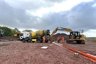
Abbas Hans, one of the Hans family members that run three sites in Yorkshire, saved a fortune doing a lot of the design work himself on their Ravensthorpe Service Station in Dewsbury.
It was a total knock-down-rebuild project and Abbas saved tens of thousands of pounds by getting involved with the shelving, refrigeration and the specially designed rafted ceiling. He takes up the story: "In the past we’d used shopfitting companies but I wasn’t particularly impressed. I’m fairly handy myself and have an eye for design so decided to do it myself. I had an idea of what we wanted and I also went to look at a number of new-build sites. The main thing was to give the shop a feeling of space so we have 2m of space between the aisles. I researched the fridges and shelving and ordered those.
"The ceiling was a bit more complicated. I wasn’t keen on either an open ceiling or a suspended one so I researched ceilings online and found a rafted design that was used at Dubai airport. I knew we could adapt this design to suit our site and found a company to do this for us.
"It was a lot of work I spent around four weeks planning it and two weeks of actual physical work but it saved us around £60,000."











No comments yet