


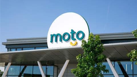
Moto Hospitality has launched a new brand identity, designed to ‘trigger smiles’, and ’transform the UK’s rest-stop experience’, in the wake of a complete brand overhaul.
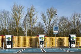
Following a comprehensive 360-degree customer review, a team from global branding agency BrandOpus, was brought in to define the new identity at the heart of the strategy and ensure the extensive shift was reflected in the branding. It coincides with the completion of the Moto’s new Rugby flagship site, which features modern amenities, children’s indoor play areas, leading high street retail and catering brands, as well as Tesla and Gridserve ‘ultra-rapid’ electric vehicle charging points.
The company says the visual overhaul marks a significant shift in the motorway service station category, aiming to flip the switch from ‘functional and sedate’ to engaging customers on a much more emotional level, so that the motorway service station provider becomes an active choice for resting and relaxing first.
At the heart of the rebrand is the Moto ‘Smile’, designed to be a ’warm and inviting symbol for the welcoming and hassle-free experience’ the brand offers.
The company says the key aspects of the new transformation include:
- The ‘Smile’ is used throughout various touchpoints - from wayfinding to floor scrubbers - injecting a big smile into the everyday.
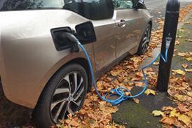
- A bold and bright colour palette featuring a fresh green, yellow and white, draws out the brand’s green credentials and uplifting nature - especially as Moto aims to play a leading role in the revolution of motorists embracing the move to electric vehicles.
- A soft and approachable typeface paired with a friendly and welcoming tone of voice to ensure the brand connects with levity and warmth.
- An expansive suite of distinctive icons was developed to aid wayfinding and signpost different zoned areas such as the baby changing areas, multi-faith prayer room, dog walking area and electric charging zone. Each application features the smile device in imaginative ways – from embedding it within the charging cable to the dog collar for the dog walking zone.
- The kids zone took on a more playful feel, with linework illustrations, in an expanded vibrant and upbeat colour palette and the same language developed throughout the wider design.
Ken McMeikan, CEO of Moto, said: “Motorway journeys can be stressful and tiring for motorists. The exciting new visual world from BrandOpus will enable us to better connect with consumers emotionally, delivering on our ambitions to transform the rest-stop experience and brighten people’s journey through life.”
Nir Wegrzyn, CEO and Founding Partner, BrandOpus, said: “We wanted to take the Moto brand from being seen as a quick pitstop - a place we stop in distress for physical and mental TLC, to an active and desired choice. Embedded within a more engaging and cohesive brand world, the Moto ‘Smile’ injects more meaning at a brand level - providing little moments of joy at every step of the customer journey.”
The branding is not only at Moto’s new Rugby site but has been rolled out across all digital touch points, and will roll out across Moto sites over the coming years.


No comments yet