Beauty is always in the eye of the beholder but there’s no disputing the stunning design of Brobot Petroleum’s flagship Southern Gateway site in Corby, Northants. Indeed so stunning is the entire site, that it picked up the Best Design and Development accolade at last year’s Forecourt Trader of the Year awards.
Maureen Tur, area manager for Brobot, describes the design as "reminiscent of the style of facility found in Italy or France. We wanted the site to have an initial striking impact but it had to be more than that. It needed the whole package of services, lots of space for car parking and a good store."
But there’s no getting away from that impressive canopy which covers the pumps. Says Maureen: "The site has been designed for maximum curb appeal, with a striking canopy that is curved on one side and slopes up around the pumps." Under the canopy is a bright blue neon light designed to make the forecourt stand out to passing traffic.
"The layout of the pumps includes enough space for two cars to comfortably fit side by side. Doors can be fully opened and, because of the increased space, there is a more relaxed atmosphere at the pumps," says Maureen.
The curved design of the canopy carries through into the shop, which features curved counters and curved gondola ends. There’s a real sense of space in the store, with its high ceiling and rail lighting. All the aisles are wide enough for pushchairs and wheelchairs.
There is also a Costa coffee with seating area and free wifi, which is great for today’s tech-hungry consumers.
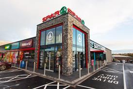
Of course, Brobot is not the only company investing in design. Conor McKibbin of Brennans Spar in Belfast spent £800,000 on his site a couple of years ago. He says it helped initially to boost business but has also enabled him to successfully trade through these past couple of difficult years.
"Anything to positively differentiate your store from your competitors, for me, is very important," he explains. "We wanted to move away from what people traditionally expected of a forecourt and enhance their overall experience and exceed those expectations. The refit and design was very well received by our customers and many commented on how ’fresh’ and ’bright’ the new store was. The layout was deemed to be less cluttered and easier to navigate."
Conor says inspiration came from many sources including trade magazines, store visits, other types of retail outlets, and what he felt was important to his customers.
When you spend lots of money, customers may think you’re going to have to put up your prices to pay for it. Says Conor: "I guess I was concerned that our customers thought we may have to increase prices, although I think our greater promotional offering assured our customers that we are eager to reinvest in our business continually."
His advice to other retailers thinking of investing in design is simple: do it to the highest possible specification and cost it out correctly.
Functional
David Davis, partner in charge of the energy sector at design agency, Minale Tattersfield, believes design is very important to a forecourt.
"Firstly, it must be functional and consider the ergonomics of the driver and pedestrian. Consumers often say they choose a station based upon location and price but the actual footfall figures show that design plays a significant role in whether a customer will choose to stop or carry on. Being memorable is important and so too is being easy to use both are components of a satisfactory ’user experience’. Design is a very important component of an overall strategy of prioritising customers’ needs."
Minale Tattersfield has worked on some striking (and very expensive looking) designs on forecourts across the world, which make many UK sites look quite bland. Davis reckons there are three reasons why many forecourt owners have not gone for a more distinctive look.
"Tastes in the UK are more minimalist than, for example, eastern markets which favour more elaborate decorative designs. The profit margins on fuel in the UK are very low compared to some other markets thus minimalising the potential for investment. And the UK fuels’ market is dominated by the major multinational oil companies and supermarkets, which have created a homogenised look. No individual entrepreneur has emerged to break the mould. It’s important to note that the costs involved in creating a bright new image require that the investment can be amortised over a network of at least 10 stations."
He adds that in developing markets operators might expect to see a 100%-plus increase in turnover after a redesign. In more mature markets, a 5-15% increase may be more likely which still in most cases justifies the investment.
As for ’green’ issues, Davis says: "Looking at most companies’ Corporate Social Responsibility statement you would think that green issues were much more important than they actually are. From our experience, companies have adopted the more practical stance of ’Don’t do it unless it is profitable’ . When, for example, one analyses the scope of more energy-efficient LED lighting systems and their added potential to lower maintenance costs, companies become far more interested."
Many forecourts have included elements that are environmentally friendly and are seeing the benefits. For example, Stevensons of Oxbridge in Stockton on Tees, has fridges and freezers using the minimal amount of electricity possible while the 3,000sq ft store’s lights run off a 13 amp plug. In addition, the canopy lights run on a dusk-till-dawn sensor so no-one can accidentally leave them on.
The Brookfield Group’s Tickled Trout site in Preston had to be designed with its actual environment in mind. That’s because the site sits within a greenbelt zone next to the river Ribble.
Once the site has caught the driver’s eye, they are greeted by a two-storey building, which has a glass frontage so customers have a good view of the interior and the glass work is complemented by quality masonry work. Inside the Brookfield News & Food store, there is a Fresh Bake bakery with a 29-seat coffee area with wi-fi and TV, so it’s definitely a site that offers style and substance.











No comments yet